WordPress block development: Building the Block
This is Part 2 of the WordPress block development tutorials. Before you read this article, please check out Part 1. There, I showed you how to set up your development environment, use the @wordpress/create-block package and understand the WordPress block files.
In this article, I’ll show you how to edit the code and run the @wordpress/scripts package to update the block we created in Part 1.
In this tutorial, we will build a block similar to the Alerts block in my Knowledge Base plugin. This is a longer tutorial than the first and the TOC is below to help you to jump directly to a specific section.
Step 1: Running the build scripts
Building our blocks uses the @wordpress/scripts package for NPM. This was automatically installed and integrated when we ran the @wordpress/create-block package. Once again, let’s take a look at the scripts section of our package.json file.
"scripts": {
	"build": "wp-scripts build",
	"format": "wp-scripts format",
	"lint:css": "wp-scripts lint-style",
	"lint:js": "wp-scripts lint-js",
	"packages-update": "wp-scripts packages-update",
	"plugin-zip": "wp-scripts plugin-zip",
	"start": "wp-scripts start"
},
The build script transforms your code using the configuration provided so it’s ready for production and optimised for the best performance. The script exits after running once.
Unlike the build script, the start script doesn’t stop. It watches the files for any changes and rebuilds the scripts accordingly.
Check out the package reference for a detailed explanation of the other scripts.
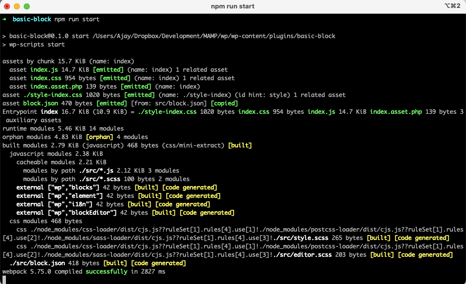
Open Terminal and navigate to the basic-block folder. Once there, run the following command:
npm run startYou will see an output similar to the below screenshot. Let’s keep the start script running while we work on editing our files.
I suggest keeping this running while you follow the tutorial below as it automatically rebuilds the block files whenever there is an update. Alternatively, you can run npm run build whenever you make any changes.
npm run startStep 2: The block editor component (edit.js)
In the final step of The first steps in WordPress block development, we inserted the block in a post and viewed the output in the backend and the frontend.
Step 2.1: Deep-dive into edit.js
The edit function contained in the edit.js file represents what the editor will render when the block is used. You can open up edit.js in your favourite editor and you’ll see the below content. I’ve cleaned out the comments in this tutorial but I recommend keeping and expanding these so you know what each function does.
import { __ } from '@wordpress/i18n';
import { useBlockProps } from '@wordpress/block-editor';
import './editor.scss';

export default function Edit() {
	return (
		<p { ...useBlockProps() }>
			{ __(
				'Example Static block – hello from the editor!',
				'basic-block'
			) }
		</p>
	);
}
If you are not familiar with import or export statements, I suggest reading Importing and Exporting components in the React.js docs.
The first line imports the __ function from the @wordpress/i18n package. This function works just the like the PHP equivalent that allows you to pass strings that are available for translation. See How to Internationalize Your Plugin for server-side documentation.
The second line imports useBlockProps() from the @wordpress/block-editor package. This is a React hook that sits at the block wrapper level – the p tag in our above example and tells the Block editor what it needs to know to manipulate the block including any extra class names.
The third line imports the editor.scss file, which customises the CSS styles used by the block editor.
Lines 5-14 create and then export the Edit component.
Step 2.2: Updating useBlockProps
Let’s make some changes to the edit.js file. The first thing is let’s pass a custom CSS class name to our block. You can do so with the following code.
const blockProps = useBlockProps({
	className: 'wz-alert',
});
We first define a constant blockProps. And we then use that in the return portion of our code. When rendered, our p tag will include an extra class name called wz-alert. The updated export function becomes:
export default function Edit() {
	const blockProps = useBlockProps( {
		className: 'wz-alert',
	} );

	return (
		<p { ...blockProps }>
			{ __(
				'Example Static block – hello from the editor!',
				'basic-block'
			) }
		</p>
	);
}
Save this file and refresh the Edit post screen to see the updated content. The build scripts will change with npm run start. Nothing will look different visually, but you can check out the extra class name in the HTML source code by right-clicking on the element and choosing Inspect in Firefox, Edge or Chrome.
Step 2.3: The RichText component
The text wrapped in a paragraph tag is the only thing our block displays right now and it is completely static. We can use the RichText component to let our users change this text.
To use this component, we will first need to import it. This is also part of the @wordpress/block-editor package. The second import line becomes:
import { useBlockProps, RichText } from '@wordpress/block-editor';Next, replace the paragraph component with the RichText component as follows:
<RichText
	{ ...blockProps }
	tagName="div"
	value={ content }
	onChange={ onChangeContent }
	placeholder={ __( 'Enter the alert text...', 'basic-block' ) }
	style={ { textAlign: align } }
/>
Let’s dig a bit deeper into each line of the above code:
tagNameis the tag name of the editable element.divin our examplevalueprovides the HTML string that can be edited. The HTML should be valid. We provide this by passing an attribute calledcontentonChangeis called when the value changes. In this example, it calls the functiononChangeContentplaceholdershows the text specified when the field is emptystyleis an inline CSS attribute. We pass the textAlign (i.e. text-align) property that will dynamically use the value set by the attributealign
For a list of the possible properties to pass your RichText component, check out the component documentation on GitHub.
onChangeContent is an event handler that is defined as below. It calls setAttributes which is used to save the updated content to the attribute content.
const onChangeContent = (newContent) => {
	setAttributes({ content: newContent });
};
To pass both attributes and setAttributes we update the line of code which contains the export statement as follows:
export default function Edit({ attributes, setAttributes }) {Step 2.4: Adding attributes
In the above example, we use a few attributes that we will need to define in our block.json file. Open up the block.json file
"attributes": {
	"content": {
		"type": "string",
		"source": "html",
		"selector": "div"
	},
	"align": {
		"type": "string",
		"default": "none"
	}
},
We define two attributes above. The content attribute is of the type string and sources the content from the div selector of our RichText component. The align attribute is a string and takes on the default value none.
The updated edit.js file looks like this:
import { __ } from '@wordpress/i18n';
import { useBlockProps, RichText } from '@wordpress/block-editor';
import './editor.scss';

export default function Edit({ attributes, setAttributes }) {
	const blockProps = useBlockProps( {
		className: 'wz-alert',
	} );
	const { content, align } = attributes;

	const onChangeContent = (newContent) => {
		setAttributes({ content: newContent });
	};

	return (
		<RichText
			{ ...blockProps }
			tagName="div"
			value={ content }
			onChange={ onChangeContent }
			placeholder={ __( 'Enter the alert text...', 'basic-block' ) }
			style={ { textAlign: align } }
		/>
	);
}
Line 9 is called destructuring assignment syntax which allows us to extract the individual properties from the attributes object. This makes the code more readable.
Line 22 sets the text-align attribute. But, we haven’t yet added an ability to modify this. We’ll do that in Step 4 below.
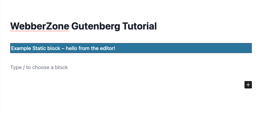
You can head back to the Edit post screen and refresh it to view the updated block. You will notice that this now has an editable field. Enter any text that you want and update the post. If you now check out the frontend, you will notice that there is no change from before. This is because we have only edited edit.js which takes care of the backend editing. We will now update save.js to update the frontend when the block is saved.
Step 3: Editing save.js
The save function defines how the different attributes should be combined into the final markup, which is then serialised into post_content. For most blocks, this should return a WordPress element which will be displayed in the frontend.
The save.js file created by the create-block package has the following content:
import { useBlockProps } from '@wordpress/block-editor';

export default function save() {
	return (
		<p { ...useBlockProps.save() }>
			{ 'Example Static block – hello from the saved content!' }
		</p>
	);
}
You’ll note that this is also what you see in the frontend of your site rather than the RichText content. Change the contents of the file to the following:
import { __ } from '@wordpress/i18n';
import { useBlockProps, RichText } from '@wordpress/block-editor';

export default function save({ attributes }) {
	const blockProps = useBlockProps.save({
		className: 'wzkb-alert',
	});
	const { content, align } = attributes;
	const className = blockProps.className;

	return (
		<RichText.Content
			{...blockProps}
			className={className}
			tagName="div"
			value={content}
			style={{ textAlign: align }}
		/>
	);
}
Many of the lines are also in the edit.js file. Key changes include:
- We only pass
attributesto thesave()unlikeedit() - We access the
useBlockProps.save()function to get the saved block properties - Return the content of the
RichTextcomponent
When you rebuild this file and then reload the editor you’ll most likely an error stating that the block contains unexpected or invalid content. This is because we’ve changed the save.js file and confused the block editor.
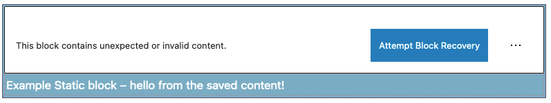
You can hit “Attempt Block Recovery” or delete the block and once again add it. Now if you modify the text and save the post, you will notice that the site frontend has also been updated.
Step 4: Adding controls to the Block Toolbar
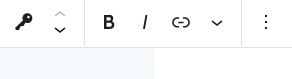
When the user selects a block, some control buttons may be shown in a toolbar above the selected block. Some of these block-level controls are included automatically if the editor can transform the block to another type, or if the focused element is a RichText component.
You’ll recall in Step 2.4 above, we added an attribute called align with a default value of none. We’ll now add an extra button to the Block Toolbar which will give us a few options on select an alignment for the text within the block.
For that, we import the AlignmentControl and BlockControls components and then include them in our return statement. We’ll also include an onChangeAlign function that will be called. Check out the updated edit.js file below.
import { __ } from '@wordpress/i18n';
import {
	useBlockProps,
	RichText,
	AlignmentControl,
	BlockControls,
} from '@wordpress/block-editor';
import './editor.scss';

export default function Edit( { attributes, setAttributes } ) {
	const blockProps = useBlockProps( {
		className: 'wz-alert',
	} );
	const { content, align } = attributes;

	const onChangeContent = ( newContent ) => {
		setAttributes( { content: newContent } );
	};

	const onChangeAlign = ( newAlign ) => {
		setAttributes( {
			align: newAlign === undefined ? 'none' : newAlign,
		} );
	};

	return (
		<>
			<BlockControls>
				<AlignmentControl value={ align } onChange={ onChangeAlign } />
			</BlockControls>
			<RichText
				{ ...blockProps }
				tagName="div"
				value={ content }
				onChange={ onChangeContent }
				placeholder={ __( 'Enter the alert text...', 'basic-block' ) }
				style={ { textAlign: align } }
			/>
		</>
	);
}
In the above code, <> and </> define a React fragment and this is needed if you include more than one component or HTML within the return. An alternative is to use a div.
Rebuild the file and reload the Edit post screen. You’ll find a new dropdown that allows you to select an alignment between left, middle or right. If you check the Code Editor view, you’ll see a markup like this if you select to centre-align the content.
<!-- wp:wz-tutorial/basic-block {"align":"center"} -->
<div class="wp-block-wz-tutorial-basic-block wzkb-alert" style="text-align:center">WebberZone Block Editor Tutorial</div>
<!-- /wp:wz-tutorial/basic-block -->
Step 5: Modifying the CSS
Let’s close this post by understanding how the CSS used to style the block is modified. As mentioned in The first steps in WordPress block development, you have to SCSS files:
- editor.scss: This only loads in the Block Editor and controls the styles that you want your user to see when they are editing the block
- style.scss: This loads in both the Block Editor and the site frontend. This is what the block will look like to the users
Depending on your use case, you can eliminate editor.scss, which is what I have done in most of my plugins. If you do so, remember to delete import './editor.scss'; from edit.js.
The content of editor.scss currently is:
.wp-block-wz-tutorial-basic-block {
	border: 1px dotted #f00;
}
This is the name of the class that wraps your block. By default, Gutenberg names your block using the namespace and the block name to keep it unique.
The above style adds a red dotted border of 1px to your block in the Edit post screen which you can see if you look closely at the below screenshot. The white text on the blue background is because of style.scss.
Below are the contents of style.scss that specifies the blue background, white text colour and padding of 2px.
.wp-block-wz-tutorial-basic-block {
	background-color: #21759b;
	color: #fff;
	padding: 2px;
}
Let’s modify this file to change the background colour to sunflower (#FFBB00) and the text colour to blue-magenta (#000036). Once the rebuild runs, you can refresh the Edit post screen.
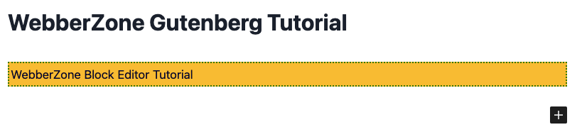
I’ve also updated the editor.scss to have a 2px dotted dark green border.
What’s next?
In this tutorial, you would have learned how to build your block. In particular:
- Using
npm runto run the build scripts - Updating edit.js and save.js files to customise the block
- Adding attributes that allow you to change specific settings
- Updating editor.scss and style.scss to update the styles of the block
In the next post, we will update the sidebar to add block-wide settings. We’ll also modify the background and text colours and create block styles, which are variations of the block.
Sources
These are a few sources that helped me learn block development and subsequently write this tutorial.


