WordPress Block Development: Customising the Settings Sidebar
In The first steps in WordPress block development, I introduced the basics of creating a WordPress block. We then dug deeper into the various block files in the second part of this tutorial series,
In this chapter, we’ll continue our journey of building WordPress blocks by extending the Sidebar in the Block Editor to add custom settings that control the block.
In Part 2, we used CSS to change the background and text colour. In this chapter, we’ll add these settings to the Sidebar.
Lastly, we’ll also learn how to create one-click variations called Block Styles.
At the end of this tutorial, we will have designed an alert box that will allow the user to:
- Add custom text they want to display within the alert
- Enter a custom heading to display above the alert and select an icon to be displayed before the heading
- Select a custom background and foreground colour
- Select a custom style for the block
Step 1: Customising the Settings Sidebar
The Settings Sidebar is used to display less-often-used settings or settings that require more screen space. You’ll find this to the right of the screen.
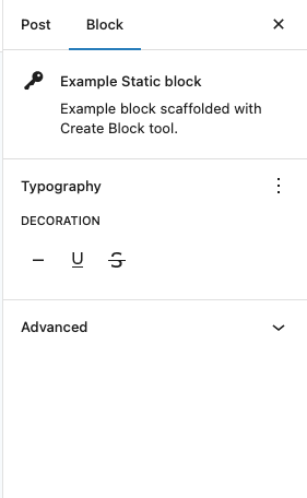
Any settings added to the sidebar apply to the entire block and not specific text or content within the block. This uses a component called InspectorControls, which forms the wrapper to the entire sidebar. You will then need to lay out elements using Panel, PanelBody and PanelRow components, as needed.
Step 1.1: Import the components
We’ll import the various components we need from the respective packages into edit.js. This example will use a few components from @wordpress/components.
import { useBlockProps, InspectorControls } from '@wordpress/block-editor';

import {
	TextControl,
	ToggleControl,
	PanelBody,
	PanelRow,
	SelectControl,
	RadioControl,
} from '@wordpress/components';
The above code imports several components:
- TextControl creates a text-box form field that let users enter and edit text
- ToggleControl creates a toggle user interface that allows you to enable or disable something. I prefer this over a checkbox
- SelectControl allows users to select from a single or multiple-option menu. It functions as a wrapper around the browser’s native element
- Panel, PanelBody and PanelRow create multiple sections of content with the Body sitting within the Panel. The Body can contain multiple rows
You can browse the components docs and examples at https://wordpress.github.io/gutenberg/ for other components that will be useful to build your block.
Step 1.2: Add attributes to block.json
Remember, in WordPress block development: Building the Block, we added attributes to the block.json file. Open it again and let’s add three additional attributes: heading, iconName and newWindow as below.
"attributes": {
	"content": {
		"type": "string",
		"source": "html",
		"selector": "div"
	},
	"align": {
		"type": "string",
		"default": "none"
	},
	"heading":{
		"type":"string"
	},
	"iconName":{
		"type":"string"
	},
	"showHeading":{
		"type":"boolean"
	}
},
Step 1.3: Display the settings in the sidebar
Once again open up edit.js and we’ll replace the code in the return statement with the following:
<>
	<InspectorControls>
		<PanelBody
			title={ __( 'Settings', 'basic-block' ) }
			initialOpen={ true }
		>
			<PanelRow>
				<fieldset>
					<ToggleControl
						label={ __(
							'Show an heading before',
							'basic-block'
						) }
						help={
							showHeading
								? __(
										'Heading displayed',
										'basic-block'
									)
								: __(
										'No Heading displayed',
										'basic-block'
									)
						}
						checked={ showHeading }
						onChange={ toggleHeading }
					/>
				</fieldset>
			</PanelRow>
			{ showHeading && (
				<>
					<PanelRow>
						<fieldset>
							<TextControl
								label={ __( 'Heading', 'basic-block' ) }
								value={ heading }
								onChange={ onChangeHeading }
								help={ __(
									'Text to display above the alert box',
									'basic-block'
								) }
							/>
						</fieldset>
					</PanelRow>
					<PanelRow>
						<fieldset>
							<SelectControl
								label={ __(
									'Select an icon',
									'basic-block'
								) }
								value={ iconName }
								onChange={ onChangeIconName }
								help={ __(
									'Icon that is displayed before the heading text',
									'basic-block'
								) }
								options={ [
									{
										value: 'none',
										label: __(
											'Select an Icon',
											'basic-block'
										),
									},
									{
										value: 'format-quote',
										label: __(
											'Quote',
											'basic-block'
										),
									},
									{
										value: 'info-outline',
										label: __(
											'Info',
											'basic-block'
										),
									},
									{
										value: 'warning',
										label: __(
											'Warning',
											'basic-block'
										),
									},
								] }
							/>
						</fieldset>
					</PanelRow>
				</>
			) }
		</PanelBody>
	</InspectorControls>

	<BlockControls group="block">
		<AlignmentControl value={ align } onChange={ onChangeAlign } />
	</BlockControls>

	<div { ...blockProps }>
		{ showHeading && (
			<div className="wz-alert-heading">
				{ iconName !== 'none' && (
					<span
						className={ classnames( 'dashicons', {
							[ `dashicons-${ iconName }` ]:
								iconName !== 'none',
						} ) }
					></span>
				) }
				<strong>{ heading }</strong>
			</div>
		) }

		<RichText
			tagName="div"
			value={ content }
			onChange={ onChangeContent }
			placeholder={ __(
				'Enter the alert text...',
				'basic-block'
			) }
			style={ { textAlign: align } }
			className="wz-alert-text"
		/>
	</div>
</>
The code above does a few things:
- Adds an
InspectorControlssection that adds the sections in which we’ll load our various settings - Inside this, we load a
PanelBodycalled Settings - Inside this, we load a
PanelRows which contains a ToggleControl called showHeading: When enabled, this will add extra fields:TextControlwith the attributeheadingwhich sets the heading textSelectControlwith the attributeiconNamewhich sets a custom dashicon that is displayed before the heading text
- Finally, we render the output of our block. This has a wrapping
divwhich holds theblockPropsthat was previously passed toRichText. This contains a headingdivwhich conditionally appears wheneverheadingis turned on and before the alert text. Because we now have a nest div, you’ll also need to update the block.json file to update the selector for thecontentattribute todiv.wz-alert-text.
The above code uses an external package called classnames which you will need to install using npm install classnames. This will update the package.json file. You don’t have to use it, but I find it as a nifty utility to handle multiple class names, particularly where you need to conditionally include a class name as we do in our example above in lines 106-107.
Step 1.4: Add functions to update the settings
We next have to add three onChange functions similar to what we did in the last tutorial.
const onChangeHeading = ( newHeading ) => {
	setAttributes( { heading: newHeading } );
};

const onChangeIconName = ( newIconName ) => {
	setAttributes( { iconName: newIconName } );
};

const toggleHeading = () => {
	setAttributes( { showHeading: ! showHeading } );
};
Remember to also update the line where we deconstruct the attributes object.
const { content, align, showHeading, heading, iconName } = attributes;Step 1.5: Reload the Edit Post screen to test the Settings sidebar
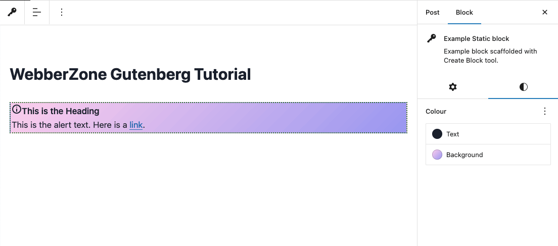
You can now reload the editor and view the updated block with its settings in the sidebar. The screenshot below has the Open in new window setting enabled, the Heading has its custom text and I’ve selected the custom icon that is displayed before the heading text.

If you’re facing any errors, please do comment below or grab the completed edit.js script that renders the above block.
This example sets the header using a TextControl. For a better user experience, you’d also set the header using another RichText component.
Step 1.6: Update save.js
If you save and preview the updated block in the front-end, you will notice no change. This is because we haven’t updated the save.js file to take account of the new attributes.
The completed edit.js and save.js
/**
 * External dependencies
 */
import classnames from 'classnames';

import { __ } from '@wordpress/i18n';
import {
	useBlockProps,
	RichText,
	AlignmentControl,
	BlockControls,
	InspectorControls,
} from '@wordpress/block-editor';

import {
	TextControl,
	ToggleControl,
	PanelBody,
	PanelRow,
	SelectControl,
} from '@wordpress/components';

import './editor.scss';

export default function Edit( { attributes, setAttributes } ) {
	const blockProps = useBlockProps( {
		className: 'wz-alert',
	} );
	const { content, align, showHeading, heading, iconName } = attributes;

	const onChangeContent = ( newContent ) => {
		setAttributes( { content: newContent } );
	};

	const onChangeHeading = ( newHeading ) => {
		setAttributes( { heading: newHeading } );
	};

	const onChangeIconName = ( newIconName ) => {
		setAttributes( { iconName: newIconName } );
	};

	const toggleHeading = () => {
		setAttributes( { showHeading: ! showHeading } );
	};

	const onChangeAlign = ( newAlign ) => {
		setAttributes( {
			align: newAlign === undefined ? 'none' : newAlign,
		} );
	};

	return (
		<>
			<InspectorControls>
				<PanelBody
					title={ __( 'Settings', 'basic-block' ) }
					initialOpen={ true }
				>
					<PanelRow>
						<fieldset>
							<ToggleControl
								label={ __(
									'Show an heading before',
									'basic-block'
								) }
								help={
									showHeading
										? __(
												'Heading displayed',
												'basic-block'
										  )
										: __(
												'No Heading displayed',
												'basic-block'
										  )
								}
								checked={ showHeading }
								onChange={ toggleHeading }
							/>
						</fieldset>
					</PanelRow>
					{ showHeading && (
						<>
							<PanelRow>
								<fieldset>
									<TextControl
										label={ __( 'Heading', 'basic-block' ) }
										value={ heading }
										onChange={ onChangeHeading }
										help={ __(
											'Text to display above the alert box',
											'basic-block'
										) }
									/>
								</fieldset>
							</PanelRow>
							<PanelRow>
								<fieldset>
									<SelectControl
										label={ __(
											'Select an icon',
											'basic-block'
										) }
										value={ iconName }
										onChange={ onChangeIconName }
										help={ __(
											'Icon that is displayed before the heading text',
											'basic-block'
										) }
										options={ [
											{
												value: 'none',
												label: __(
													'Select an Icon',
													'basic-block'
												),
											},
											{
												value: 'format-quote',
												label: __(
													'Quote',
													'basic-block'
												),
											},
											{
												value: 'info-outline',
												label: __(
													'Info',
													'basic-block'
												),
											},
											{
												value: 'warning',
												label: __(
													'Warning',
													'basic-block'
												),
											},
										] }
									/>
								</fieldset>
							</PanelRow>
						</>
					) }
				</PanelBody>
			</InspectorControls>

			<BlockControls group="block">
				<AlignmentControl value={ align } onChange={ onChangeAlign } />
			</BlockControls>

			<div { ...blockProps }>
				{ showHeading && (
					<div className="wz-alert-heading">
						{ iconName !== 'none' && (
							<span
								className={ classnames( 'dashicons', {
									[ `dashicons-${ iconName }` ]:
										iconName !== 'none',
								} ) }
							></span>
						) }
						<strong>{ heading }</strong>
					</div>
				) }

				<RichText
					tagName="div"
					value={ content }
					onChange={ onChangeContent }
					placeholder={ __(
						'Enter the alert text...',
						'basic-block'
					) }
					style={ { textAlign: align } }
					className="wz-alert-text"
				/>
			</div>
		</>
	);
}
import classnames from 'classnames';
import { __ } from '@wordpress/i18n';
import { useBlockProps, RichText } from '@wordpress/block-editor';
export default function save( { attributes } ) {
const blockProps = useBlockProps.save( {
className: 'wzkb-alert',
} );
const { content, align, showHeading, heading, iconName } = attributes;
const className = blockProps.className;
return (
<>
<div { ...blockProps } className={ className }>
{ showHeading && (
<div className="wz-alert-heading">
{ iconName !== 'none' && (
<span
className={ classnames( 'dashicons', {
[ `dashicons-${ iconName }` ]:
iconName !== 'none',
} ) }
></span>
) }
<strong>{ heading }</strong>
</div>
) }
<RichText.Content
tagName="div"
value={ content }
style={ { textAlign: align } }
className="wz-alert-text"
/>
</div>
</>
);
}Step 2: Use Block Supports to change the background and text
The block editor has an amazing API called Block Supports that allows a block to declare support for certain features. When you add support for any feature, they get added to the object returned by the useBlockProps hook.
We will use this feature to add a custom background and text colour to our block. Open block.json and update the supports attribute with the below code:
"supports": {
	"html": false,
	"color": {
		"gradients": true
	}
},
The background and text keys have a default value of true and will be enabled by default. Additionally, UI controls which allow the user to apply a gradient background to a block are also enabled.
Refresh your post and you’ll now be able to change the text and background colours.
Step 3: Adding Block Styles
Block Styles allow alternative styles to be applied to existing blocks. They work by adding a class name to the block’s wrapper. This class name can be used to provide an alternative styling for the block if the block style is selected.
Step 3.1: Update block.json
The easiest way to add Block Styles to your block is to use the block metadata property called styles in your block.json file.
The styles property takes two mandatory properties called name and label. The former is used in your CSS file to make your block look different. The latter is shown in the sidebar where you can click to change the various styles.
Additionally, you should set a default style by adding a third property called isDefault.
"styles": [
	{
		"name": "default",
		"label": "Default",
		"isDefault": true
	},
	{
		"name": "red",
		"label": "Red"
	},
	{
		"name": "green",
		"label": "Green"
	}
],
In the above example, I have defined a default block style and also created two different styles called Red and Green.
Step 3.2: Update style.scss
The block editor will add three buttons as you can see from the below screenshot. Clicking on any of the buttons add an extra class is-style-{name} using the name property for each style as defined above.
The next step is to update style.scss to include the conditional styles. Here’s the completed version:
.wp-block-wz-tutorial-basic-block {
	padding: 0.75rem 1.25rem;
	margin-bottom: 1rem;
	padding: 2px;
	background-color: #FFBB00;
	color: #000036;

	&.is-style-red {
		background-color: #ff4400;
		color: #ffffff;
	}
	&.is-style-green {
		background-color: #03210a;
		color: #ffffff;
	}
}
As we are using the SASS, we add conditional styles using &.is-style-{} class names which override the default style.

To display a preview of the styles when inserting the block, the block.json file needs to be updated with an empty property "example": {}.
Bonus: Adding custom stylesheets
In the block.json metadata, we use the editorScript, editorStyle and style properties to pass the location of the CSS and JS files relative to the location of block.json. Alternatively, you can pass the handles used to register scripts and styles using wp_register_script and wp_register_style.
Since WordPress v6.1.0, you can also pass an array of handles or files that the block editor will register automatically.
If you’re trying to add support for versions prior to WordPress v6.1.0, you can use these two hooks:
enqueue_block_assets: block assets for both editor and front-endenqueue_block_editor_assets: block assets for only the editor and front-end
This is some sample code from my plugin Contextual Related Posts that uses the second hook to add custom CSS to the block in the block editor. This is also an example of a dynamic block which we will cover in the next chapter of this tutorial.
function crp_enqueue_block_editor_assets() {

	$style_array = crp_get_style();
	$file_prefix = ( defined( 'SCRIPT_DEBUG' ) && SCRIPT_DEBUG ) ? '' : '.min';

	if ( ! empty( $style_array['name'] ) ) {
		$style     = $style_array['name'];
		$extra_css = $style_array['extra_css'];

		wp_enqueue_style(
			'related-posts-block-editor',
			plugins_url( "css/{$style}{$file_prefix}.css", CRP_PLUGIN_FILE ),
			array( 'wp-edit-blocks' ),
			filemtime( CRP_PLUGIN_DIR . "css/{$style}{$file_prefix}.css" )
		);
		wp_add_inline_style( 'related-posts-block-editor', $extra_css );
	}
}
add_action( 'enqueue_block_editor_assets', 'crp_enqueue_block_editor_assets' );
We will not use this in the block that we are developing as part of this tutorial.
What’s next
We have now come to the end of our very long tutorial on customising the block. I hope that the various steps above have made it easy for you to understand the basics of modifying the block.
You should have learnt how to:
- Build a custom sidebar and add block-wide settings
- Add settings to change the background and text colours
- Create block styles and enqueue block assets
The block editor is extremely powerful and I’ve been learning a lot by browsing the code in the Gutenberg repository.
Although it is evolving at a steady pace, I hope these three chapters will allow you to get your feet wet, or even better leap into the shallow end of the development pool.
In the next chapter, we’ll take a look at creating dynamic blocks. These blocks are, in my view, easier to build as you don’t need the save function. The settings are passed to the block and you can then use PHP to render the block just as you would to create a shortcode or a template tag.
The code on GitHub
The completed code from the first three tutorials is available on GitHub for you to study, download and practice.
You can view the source code on GitHub.
Sources
These are a few sources that helped me learn block development and subsequently write this tutorial.


